Testing Scribd
This is a test to distribute a handout for binding a simple pamphlet stitch book.
Pamphlet Binding Stitch
This is a test to distribute a handout for binding a simple pamphlet stitch book.
Pamphlet Binding Stitch
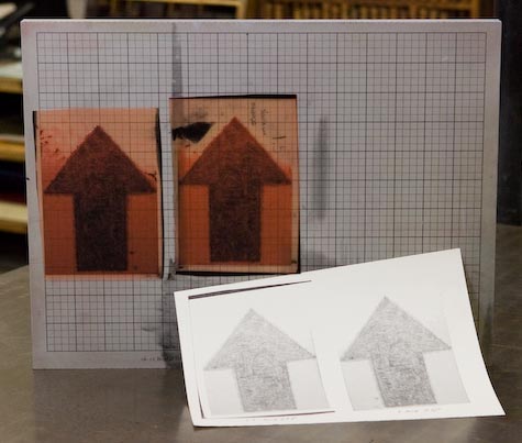
 Dennis Michael Peterson drew a large arrow on frosted mylar. As an experiment, we thought it would be fun to take a digital photo of the drawing and scale it down to print it on our letterpress printing press. His original graphite drawing is about 2 x 3 feet. In Adobe Photoshop we converted the image to a greyscale, set the image size to 8.5 x 11 inches and set the resolution to 300 ppi. The kind folks at Smartset in Minneapolis, MN made the negative for us and quickly mailed it to us. These plates are actually smaller samples that we had made for printing on a post card. Once the larger version is done, we will add more images to this post.
Continue reading…
Information and photos from Sandra Anible’s paste paper demo will be posted soon. Write me if you did not pick up one of her handouts.
When you select a font in InDesign® from the font menu, check the icons to the left of the font’s name. The icon is there to let you know the type format. The O indicates OpenType fonts, the TT is for TrueType fonts and the red a is for PostScript fonts. Get to know the advantages of each format.
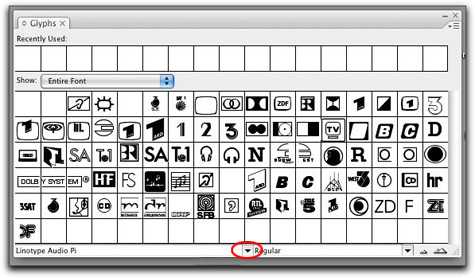
 Once you explore all of the characters in your favorite type face or font, you may want to see what else is hidden in the keyboard map for the font. For example, how many times have you wondered were the © symbol is located, or where the ® symbol for registered product names? Better yet, you may have the need to check out the full keyboard map for a glyph or symbol font like Zapf Dingbats or Carta. Glyph fonts like these are only a few of the available fonts to you in the lab. Alternative type characters or glyphs can be hard to find. Luckily inside of InDesign and Illustrator you can easily find a map of the keyboard layout. InDesign’s Glyph menu can be found by going to the top menu bar > find Window> scroll down to Type & Tables > then down to Glyphs. A window like the one above will appear. Select the font you want to see by clicking on the small arrow that is circled in red.
Click on this link if you need a pdf file of the first handout. We will spend more time in class on different aspects of the assignment.
Click on the thumbnails above to see lots of photographs of student work from the summer session. Please visit and enjoy the work that this group created. It was a great group of students. We had fun making books and some of the students made paper as well. Great time was had by all.
Copyright © 2004–2009. All rights reserved.
RSS Feed. This blog is proudly powered by Wordpress and uses Modern Clix, a theme by Rodrigo Galindez.