Two-Signature Pamphlet demo
This video tutorial demonstrates a nice way to sew two signatures into a cover wrapper. This saves some time as you can quickly sew a printed cover on a two signature book, using the simple three-hole pamphlet stitch.
This video tutorial demonstrates a nice way to sew two signatures into a cover wrapper. This saves some time as you can quickly sew a printed cover on a two signature book, using the simple three-hole pamphlet stitch.
https://youtu.be/xC6p63xnSj0
I don’t use mythel cellulose paste too often. I like when a paste give a stronger bond. But when you need a paste to make book cloth, methyl cellulose is a one paste to use. I keep methyl cellulose powder in the classroom as you never know when you might need it. When I need paste to make book cloth, I like to have a thicker paste. In this video, I heated water till approximately 150 degrees (70 celsius) and then added 18th of a cup of powder to 1 cup (275 ml) of hot water. I needed a full cup of paste to make the two sheets of book cloth. I did have some left over. It is better to make more than you need. It really does take time to fulling formulate. I would hate to be in a situation where I needed a bit more paste and had to make it on the spot. As it happened another student was working with a faux leather book cover and wanted to try using a mix of PVA and Methyl cellulose (MC). When you mix the two at 50% to 50%, you keep some of the bonding qualities of the PVA but gain some open time to work the book cover. At the end of the video can see that the PVA does not look all that different. It is important to label your jars if you want to be sure you know which jar contains the past or adhesive you want to use. I will be working on a video on how I used the book cloth from this vide.
Book cloth is made in many colors and out of many different materials. But sometimes, you just have to use a fabric for a book cover. The fabric pattern or color might be just what you want to use for the cover. This video will show you how to make book cloth out of fabric. In this video I used some vinyl drafting board cover under the fabric. Many people use glass or plexiglass and some use large sheet of binders board. If you want to make book cloth you should buy enough to experiment. Your fabric might need some adjustment to how this one was made. It might take an extra few steps, but the fabric might make your book exactly what you want it to be.
Early in the semester, you will learn how to sew a book using the pamphlet stitch. The single signature book offers creative options for a book. Books that have spines less than 5 inches in length, you might want to use a three hole sewing pattern. Written instructions for a three hole pamphlet stitch can be seen at this link. In this video, a five hole sewing pattern is demonstrated. A book from a signature is often called a chapbook. In commercial printing job, this type of binding is called saddle stitch. This video illustrates a hand stapler is used in saddle stitching. Whatever you wish to call this type of book, the pamphlet stitch is used in many creative book projects. This pamphlet book gallery has some student examples.
In this demonstration an 18/3 thread was used. You can learn some information about bookbinding threads in this blog post.

Two stages of corn husk preparation. The full corn husk has been cooked and still wet. The threaded fibers are the result of being processed in the hollander pulp beater.
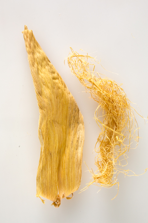
Corn husk (left) has been cooked and dried. Fibers (right) were removed soon after the beating process started.
On November 13th, 2014, a few students and I will be working on a quick book project as part of the “Under the Influence” program at 6 pm. One of the book structures we will explore is the Turkish Map Fold. Thanks to Sona Pastel-Daneshgar for demonstrating in the video.
The video has no audio beside the ambient sound of ruffled paper. I can add some comments if you need to hear what we did. Otherwise, watch carefully as Sophie cases in her book block. We did not add any mull or book clock for the hinge. The cloth often levels out the bumps created by the tapes on the inside of the cover. Sophie cut out a few layers of the board to nest the tapes inside of the boards. Once the adhesive dried, we opened the book to show you how it looks. I will add a new video once she pastes down an end sheet to cover the board and hinge. Stay turned. Listen carefully for sound from the shop. You might hear the board sheer and the ruffling of waste paper
Copyright © 2004–2009. All rights reserved.
RSS Feed. This blog is proudly powered by Wordpress and uses Modern Clix, a theme by Rodrigo Galindez.